
Evaluation and Redesign of Uline's Settings Page
Our task was to redesign Uline's settings page and cater it to large-scale businesses purchasing on their website. By leveraging research, testing, and iterative prototyping, we redesigned the page to offer a more intuitive and efficient experience, making it faster and simpler for users to manage their account settings while staying true to Uline’s established brand identity.
E-Commerce
Jan 2024 - May 2024
Competitive analysis
High-fidelity interactive prototypes with figma
Goal
Redesign Uline.com’s Settings Page to enhance usability and align with the company’s design system
Utilize insights from competitive analysis, usability testing, and evaluation to improve functionality and elevate the user experience.
My Role
I helped guide the project while conducting a heuristic analysis of the page by utilizing Nielsen's 10 heuristics.
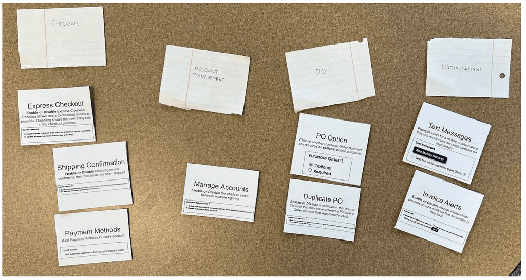
While finalizing the information architecture, I facilitated a card-sorting activity to help categorize and organize the page.
In Figma, I collaborated with a team member to develop high-fidelity interactive prototypes to represent the user's journey through the page, followed by conducting user testing.
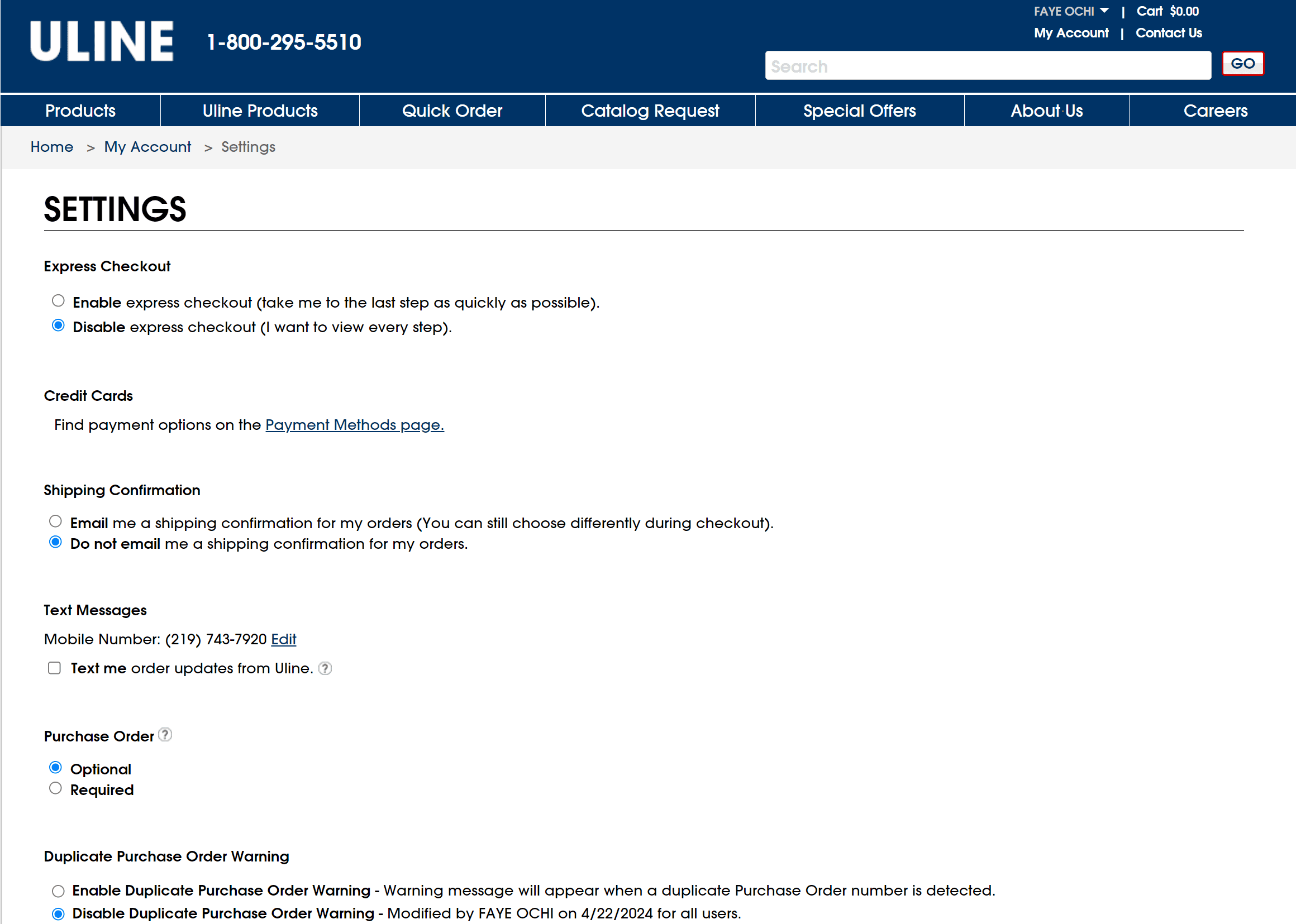
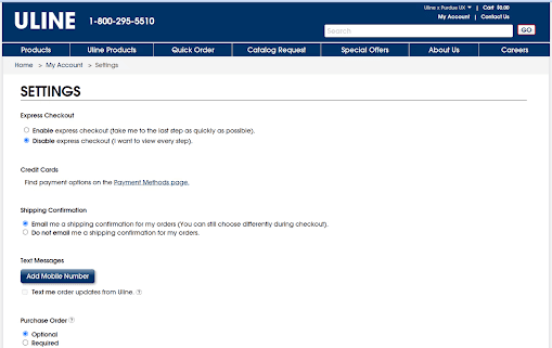
Current State
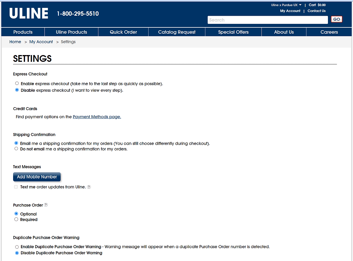
Our sponsors presented us with improving the current settings page on Uline.com.
Key Features:
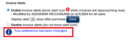
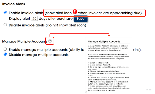
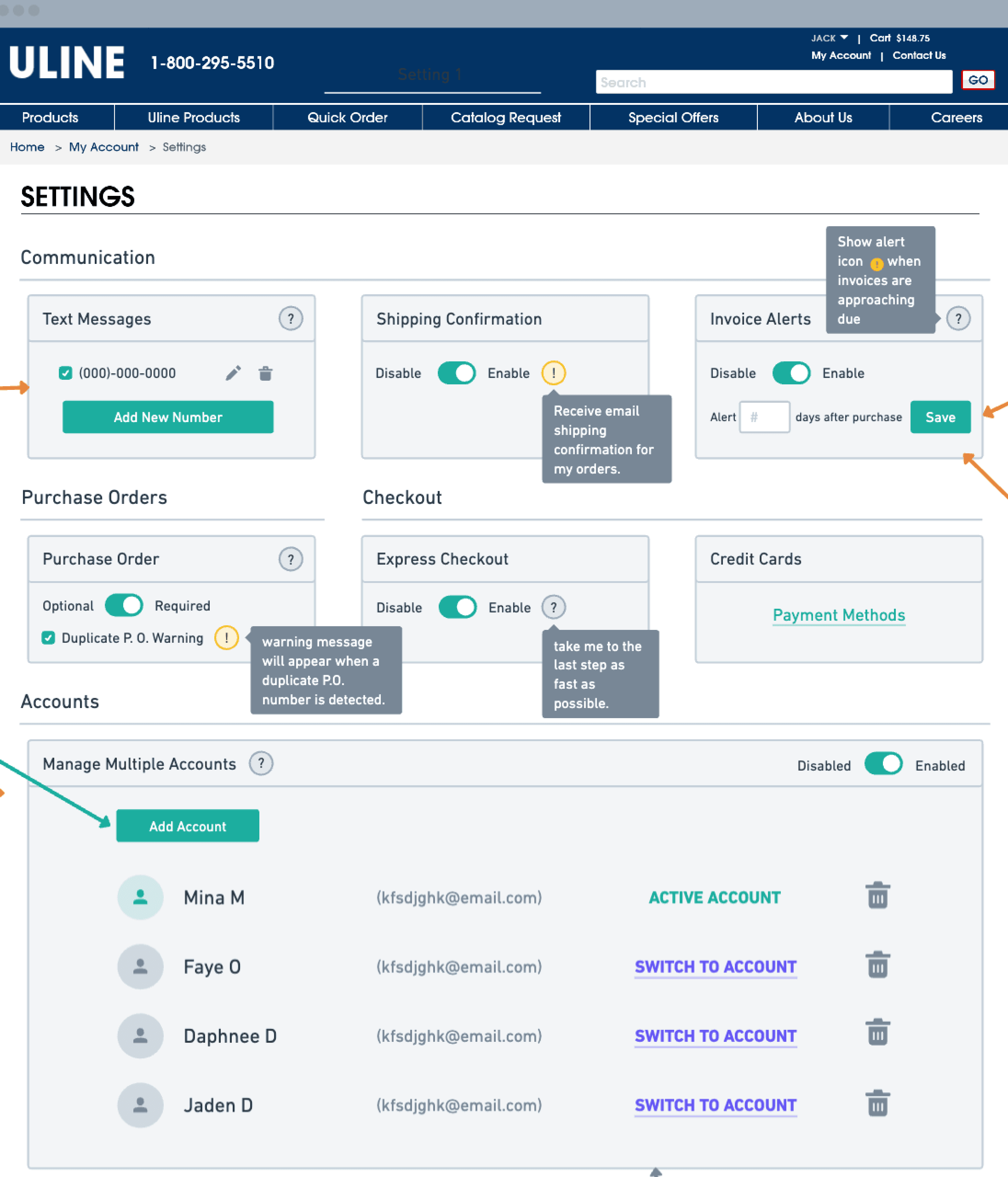
Radio buttons
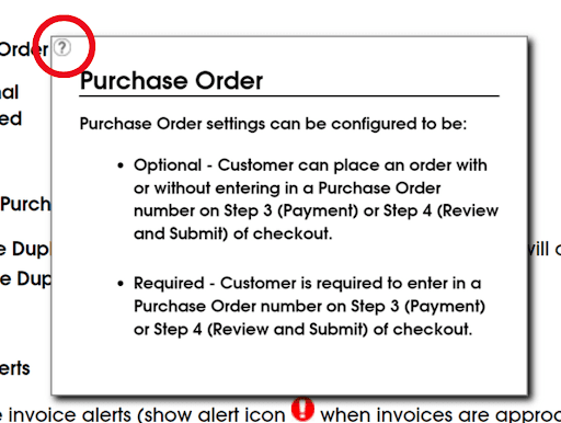
Hovering on "?" icons presents a pop-up with additional information
Single column requires scrolling
Background
About
Uline is the leading distributor of shipping, industrial and packaging materials to businesses throughout North America.
Goal
Uline asked us to "redesign their current Settings page using design thinking"
User Group
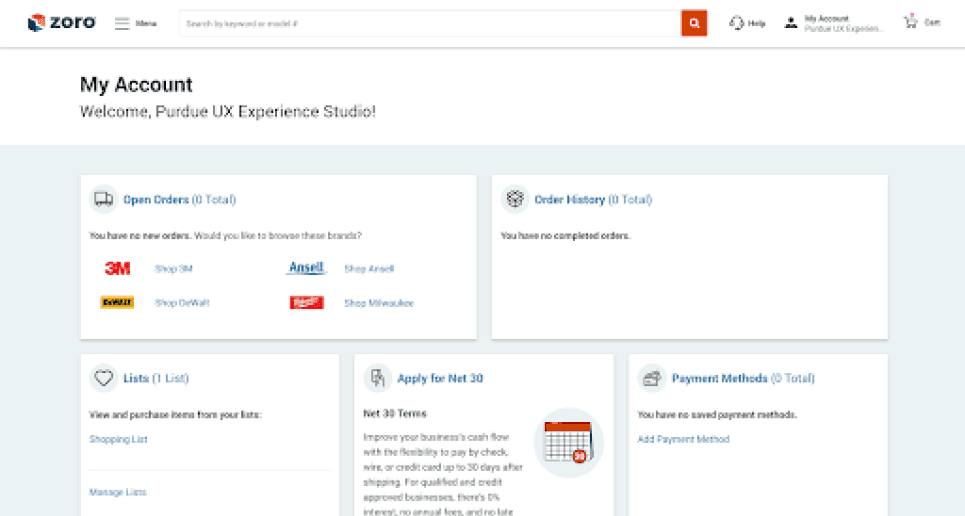
Employees who make purchases through Uline on behalf of large businesses.

Understanding the Problem Space
How might we gain a foundational understanding of core use cases and stakeholders?
Evaluating Functionality & Aesthetics
How might we evaluate the current state to understand usability problems?
Successes
Painpoints

Developing Redesign Suggestions
How might we use our findings to create a high-fidelity prototype that addresses user needs and improves on existing functionality?
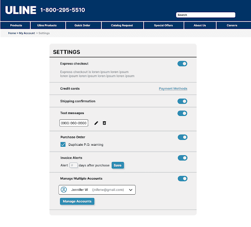
Low-fidelity wireframing
Goals throughout this process were:
Reduce scrolling
Stay consistent with Uline’s design system and minimalist UI values
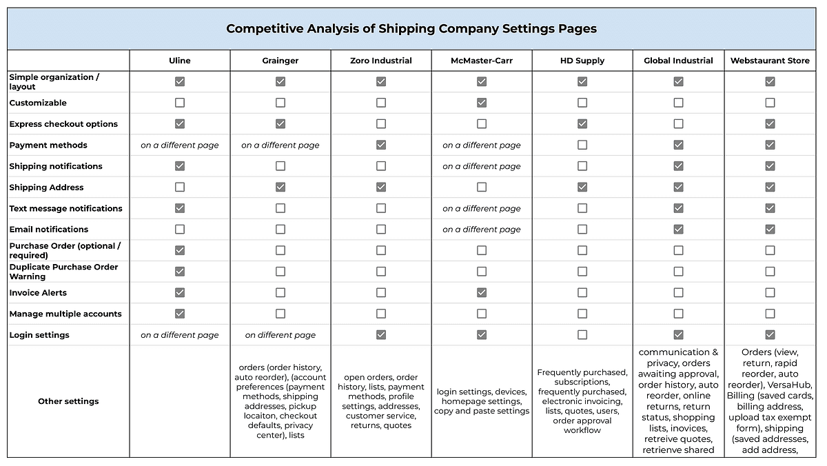
Taking inspiration and UI elements from competitive analysis
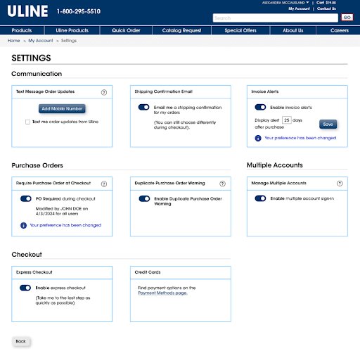
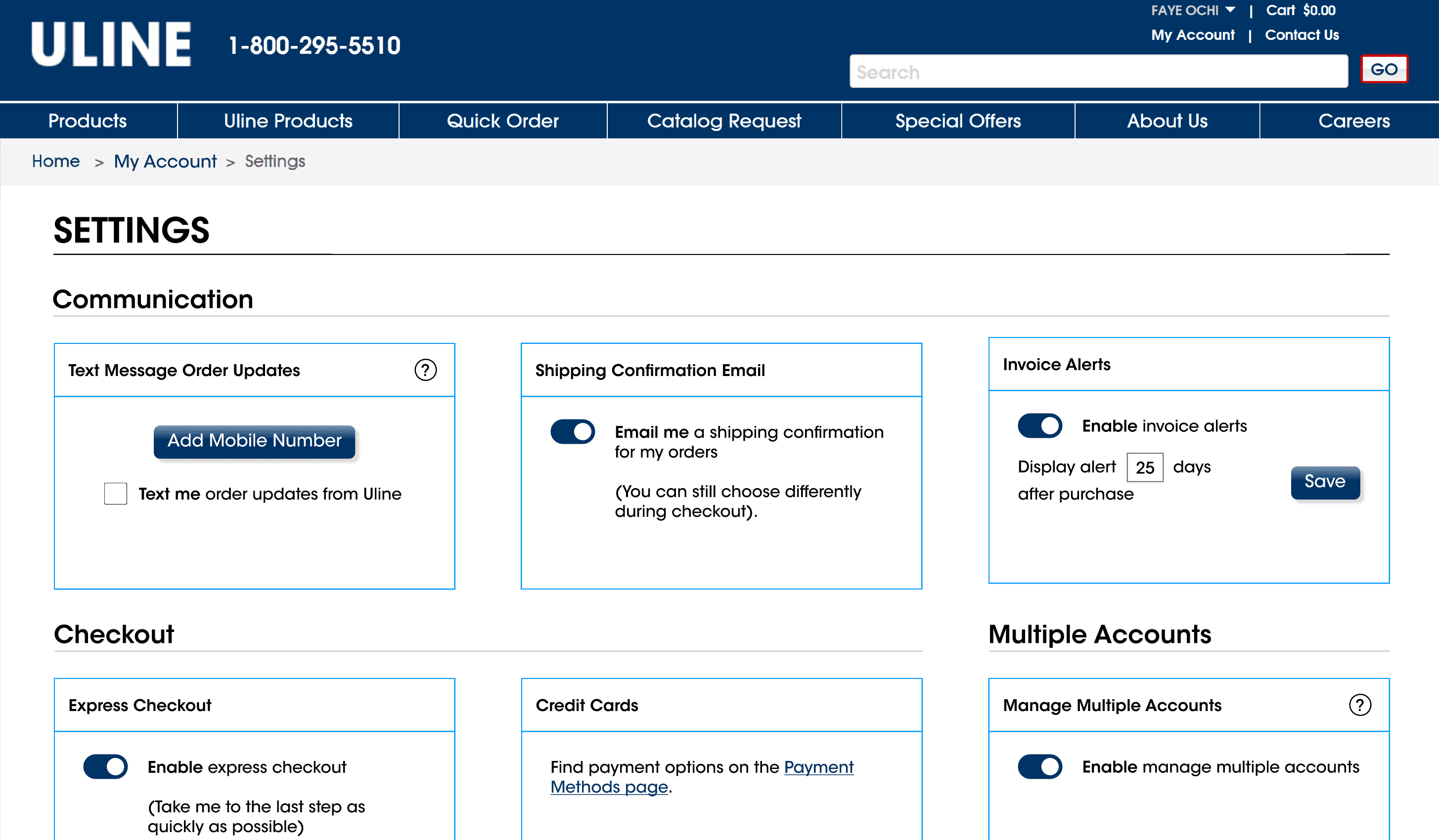
High-fidelity
We received sponsor feedback (click here) to help guide our final design. We created interactive high-fidelity prototypes to present our final redesign.
Key Changes
Using boxes to visually separate different settings throughout columns
Columns help reduce amount of scrolling
Grouping settings into categories for easy navigation
Toggles instead of radio buttons to save space and look more visually pleasing
Editing the copy on some settings to provide users with more context
Fixing design inconsistencies
The back button on this page was inconsistent with other Uline webpages
Hand-off to Uline's UX Team
After completing testing, we presented our final redesign and research results to Uline's team and our peers. View our presentation here.
Reflection
Reflecting on my experience working with the design team at Uline, this project highlighted the importance of balancing usability with brand consistency.
Furthermore, it showed me how even small design adjustments can significantly improve user efficiency and satisfaction.
Working alongside Uline’s team and presenting our findings strengthened my confidence in conducting and communicating design work. This experience has refined my design skills and reinforced my commitment to creating intuitive, efficient, and impactful digital experiences.
Collaborating with my team in developing high-fidelity prototypes in Figma further enhanced my skills in rapid iteration and incorporating feedback effectively.