
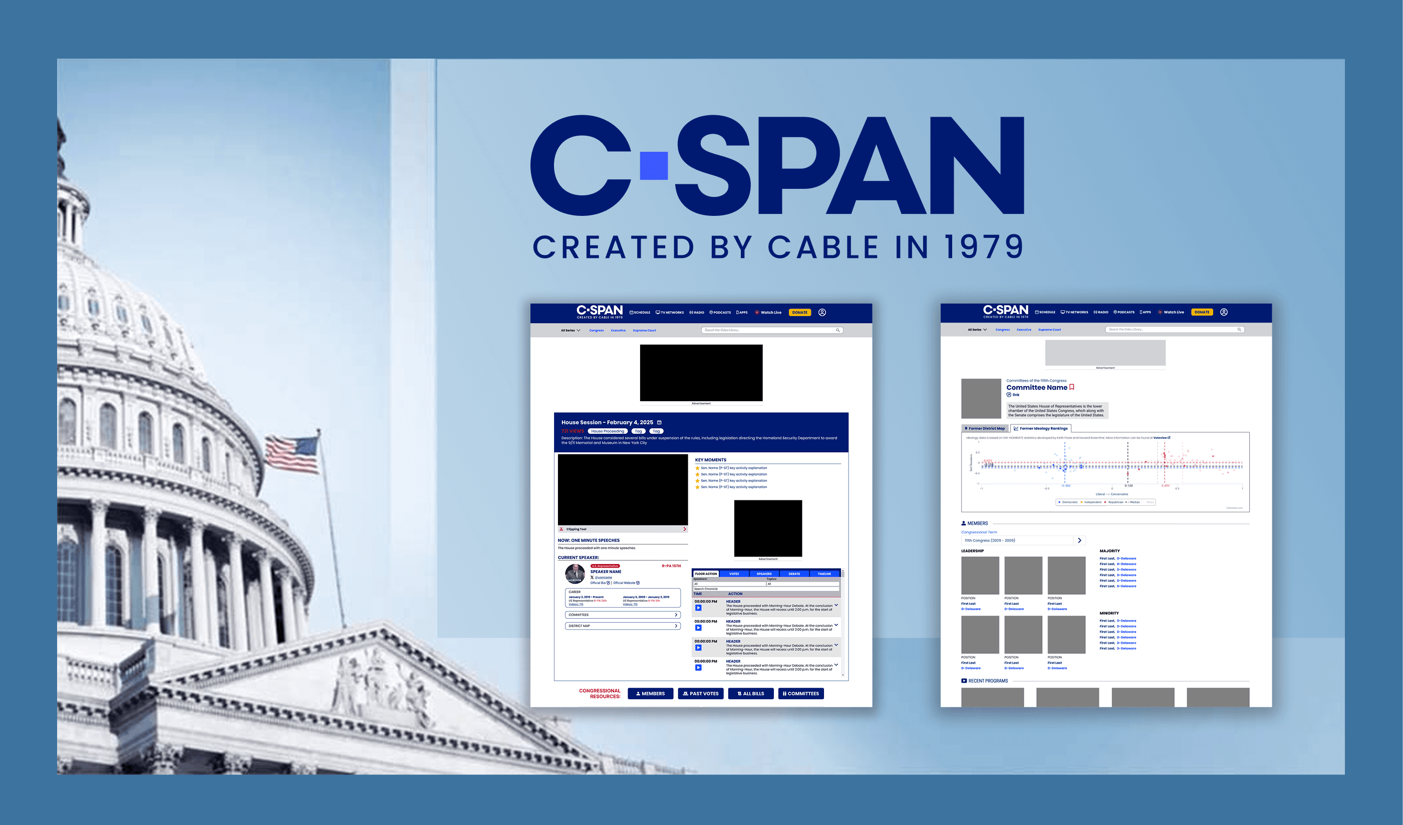
Enhancing C-SPAN's Digital Experience
During my internship at the C-SPAN Archives, I improved the experience of
C-SPAN's digital archives, which houses decades of government video footage and transcripts.
C-SPAN Archives
UX/UI Developer
Jan 2025 - Present
News Media & Technology
Digital Archives
Government & Politics
My Role
My role involved redesigning key pages of the website through two-week sprints—each beginning with a new page assignment from my manager.
I spent the sprint researching, designing, and refining wireframes in Figma. I then presented interactive wireframes to developers to ensure a smooth handoff by communicating user interactions and design rationale.
Final designs were presented and reviewed with the development, marketing, and digital media teams for implementation.
Results
I have completed 6 design sprint focused on different pages on C-SPAN's website
Establishing a Design Culture at C-SPAN
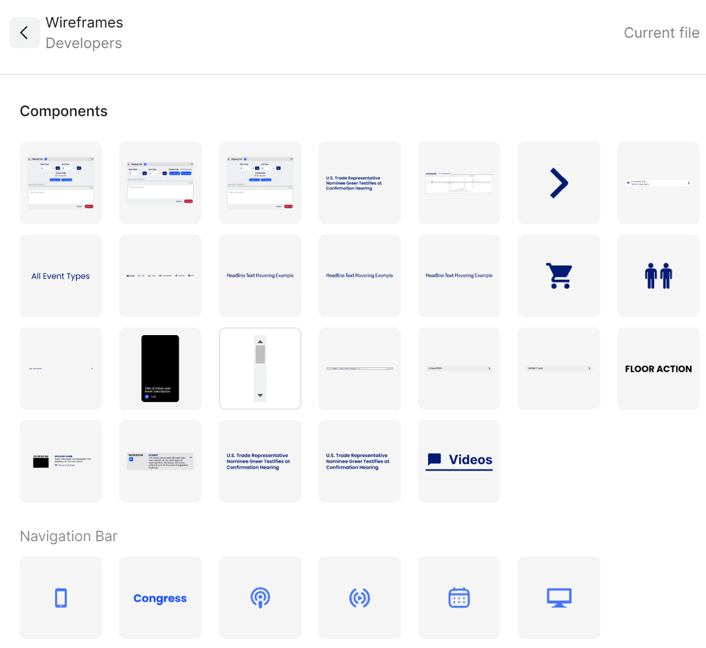
As the first UX designer on C-SPAN’s digital team, I helped lay the foundation for a design culture by introducing UX workflows, creating a shared Figma component library, and establishing cross-functional design reviews.
I collaborated closely with developers and technical managers to ensure design decisions were grounded in usability, consistency, and clarity—setting a precedent for integrating design into the development process.
Creating a Component Library
To support consistency and scalability, I established C-SPAN's first component library in Figma—featuring over 40 reusable components including cards, transcript formatting, buttons, icons, and more—enabling faster prototyping and standardization across the redesign.
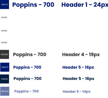
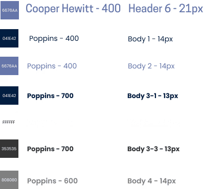
Style Guide
I modernized C-SPAN’s outdated style guide by translating it into a cohesive, interactive Figma design system—organizing and updating key brand assets including logos, typography, color palettes, and button styles. I also defined clear usage guidelines to ensure consistency across platforms and improve handoff between design and development
Creating a Component Library
Creating a Component Library
35%
Improved onboarding process
25%
Increase in user retention
84%
Increase in time spent on website


“ With our new visual branding and language in place, the new Shopify brand clearly captures the essence of our current and target customer base, our employees, and our values. ”
Tobias Lütke
CEO, Co-founder | Shopify


Conclusion
The StreamLine mobile banking app redesign successfully addressed the usability issues, resulting in a more intuitive and user-friendly experience. The improved UX/UI design led to increased user adoption, engagement, and satisfaction, demonstrating the value of a well-designed template for UX designers.